
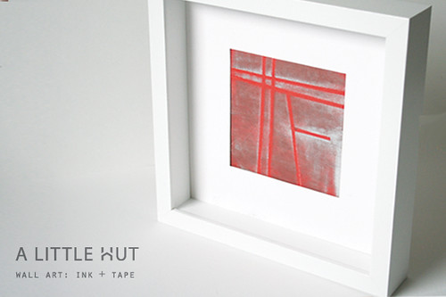
Stepping out of my comfort zone is not something I do easily. But I gave it a shot with this and I flopped—sort of. Ink pads and me—we're still working on maintaining an amiable relationship. However, I am surprised that I that this red square is growing on me. It isn't typical of me—maybe that's why?
I don't really show what didn't work, do I? I don't think it's because I don't want to, but simply because I either forget or I crumple up the evidence in frustration, before I realize that it would've been a good thing to show what not to do. Maybe it's the perfectionist in me, taking over on the sly.
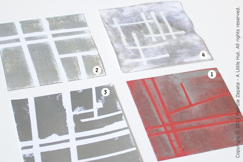
In any case, here are the disasters that occurred after the framed piece above. Yes, I said after. It just got worse and worse...
1. Red background - The photos don't do it justice. The silver ink (which looks whitish) is quite striking but subtle.
2. My second attempt - It didn't go too badly (again, the texture looks much better in person), until pulling the tape messed up parts of it. I don't like that I only used one width of tape throughout. There's no contrast.
3. You can't tell but this one is really shiny. It looks metallic. The entire gray area is covered in silver embossing powder. The flaws are more than evident!
4. By this one, I'd given up on the tape design and just wanted to see what would happen with white embossing and ink with water. I couldn't find my watercolor paper which is what I really wanted to use. Ugh. Enough said.
The kicker of the story is that I wanted to make this a video tutorial and I started recording the process with version number 2. Awesome. The other failures are recorded too (reminder: delete! delete!). Don't worry I'm not going to waste your time with all that. The red piece was supposed to be the additional color option. As in... "Here is another piece that I worked on in colored paper. See the difference?" Yep. I sure do!
So, in case you are interested in trying this out (no guarantees on results!) here is what I used for the red background piece:
- Silver ink pad
- Brown ink pad
- Red Card stock - 5" (13cm) square
- Martha Stewart Patterning Tape
- Embossing heat gun
- Ranger Inkssentials Craft Sheet
1. Place the tape on the paper in a diagram that forms a general idea of the map of where you live.
2. Rub the ink pad across the paper in a side-to-side direction direction only. Don't press too hard—so that some streaks show.
3. Let it dry (I used the embossing heat gun to speed the process up).
4. Turn the paper 90˚ and repeat step 2 with the brown ink.
5. I removed the tape and heat set the second layer of ink.
I worked on the Ranger Inkssentials Craft Sheet for the entire project. With all the ink involved, I typically would've gone through a bunch of scrap paper, to protect my work surface, or my cutting mats would've taken a dirty beating. I'm very picky about the latter since I work with white paper so much. It's the first time I use this craft sheet and I couldn't be more pleased. With a few wipes of a damp cloth it was ready to go again. It still looks like I just pulled it out of the box. Awesome product!
FYI: This is not a sponsored review. The sheet was a personal purchase.
I learned about this sheet through the Inspiration Showcase, a class that I'm currently taking. Jennifer McGuire is an excellent teacher and the amount of techniques that are included in the class are incredible. I'm not a card maker per se, but I decided to jump in to see what I could learn—boy I'm glad I did! I haven't had a chance to buy all the materials I need to complete the assignments (which makes this project even more embarrassing!) but I will definitely get there.
• • •
Lessons of the day?
- I never know when it will be right. In this case the first try was IT. That doesn't mean I shouldn't keep trying.
- I should leave the beaten path more often—it's liberating, even if I trip.
No comments:
Post a Comment